Have you ever logged on to your WordPress website only to find that it wasn’t rendering correctly? In an increasingly mobile-focused world, making your incredible website mobile-friendly is essential. It may attract new customers, increase sales, and improve SEO rankings by bringing more traffic from Google searches. This article will provide you with five key tips.

Install Mobile Optimised Plugins
As a WordPress user, you’re probably familiar with plugins. Simply put, they are small software that adds extra functionality to your website. Here are some common ones: WPTouch and JetPack. They might sound simple enough, but they can introduce several issues if not set up correctly.
The best way to ensure they work properly is by installing them yourself so that you know what’s happening behind the scenes (we recommend using FTP). If installing mobile-optimized plugins isn’t your thing, feel free to use the handy step-by-step guide for installing mobile-optimized plugins in WordPress. In the same vein, taking care of your site’s security by employing plugins like WP Force SSL to ensure a secure HTTPS connection, and WP Login LockDown to safeguard your WordPress login from unauthorized attempts, can enhance the overall health of your website.
Consistent Content On Mobile And Desktop Websites
When it comes to the content on your website, make sure that it’s the same and consistent on both mobile and desktop versions. This method will provide consistency in look and feel across all devices while also making it easier for users who visit your site on their phones or tablets to identify which content they should look at on their devices.
Keep your content organized so visitors can easily find information on both versions of your site. Consider breaking up long pages into shorter pages so users can easily see where they left off when switching from one device to another.
Incorporate Google AMP
Google AMP lets you publish content that loads instantly and renders on mobile devices. It’s a way of making your content more mobile-friendly. This method creates an entirely new set of rules for the web platform. It would be best if you served all AMP pages from several domains, and each page must be served with encrypted cookies.
When someone visits an AMP webpage in Google Search results, they’ll see a visual indicator telling them that it’s an “AMP version” instead of the standard version, along with metadata about what features have been disabled (like video embeds or image carousels).
Responsive Design For The Mobile Version
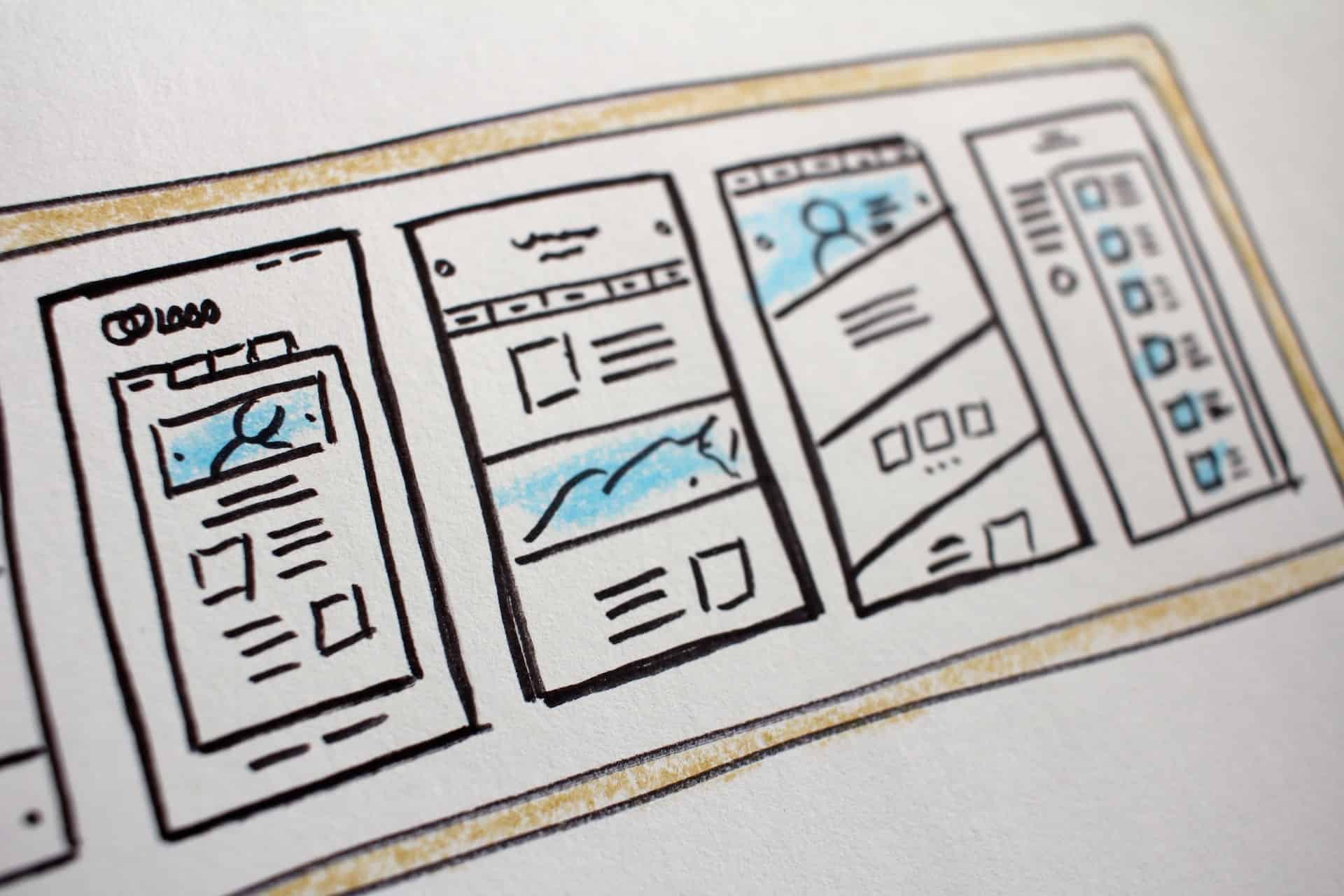
No matter what you are doing, whether it is messaging, online shopping, gaming, playing some of the best Yggdrasil online slots, research, or scrolling through social media, the responsiveness of your device is essential for your user experience. Responsive design is a web design approach that aims to provide an optimal viewing experience. It must be easy to read and navigate with minimum resizing, panning, and scrolling across various devices. With this method, all content will be displayed correctly on any device, irrespective of its screen resolution, no matter how small or large. Some people believe that it’s the future of the internet and that people will primarily access the web through mobile devices.
Conclusion
Making your website mobile-friendly is a great way to increase your conversion rates. It’s also essential for SEO and ranking higher in Google searches. Sometimes, it’s not very easy to tweak your website and make it mobile-friendly yourself. In this case, you can rely on professional WordPress development services. Whichever method you choose, optimizing your site for mobile is a surefire way to keep visitors coming back for more and help grow your business online.