Creating an effective flyer is all about catching someone’s attention, then keeping it long enough for them to read through the information you’re trying to convey. And while it may seem like a simple task, those who understand the minutiae of design know that there’s a lot that goes into creating the ideas behind a well-thought-out flyer.
It can get difficult, especially for those who don’t have as much experience in the field of design. Luckily, there are a number of flyer makers online tools out there that come with a flyer maker, which eliminates the need for knowing advanced design philosophies. They make things blessedly simple, easy, and fast. You can also check free graphic design software download and get your job done in no time.
But if you want to further customize your templates and are looking for flyer design ideas to spice them up, even more, consider adding one or two of the following elements!
How to Design a Flyer:
Use Striking Imagery
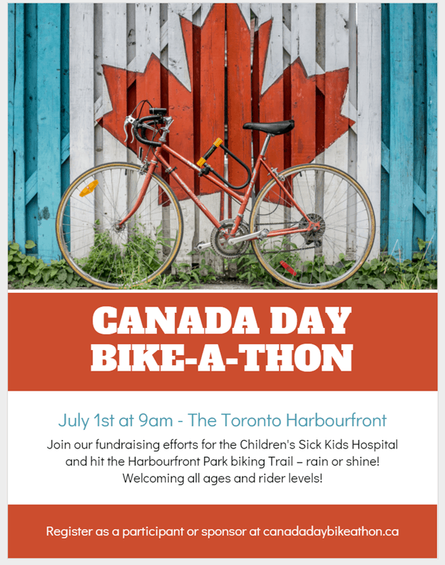
One of the best ways to catch someone’s attention is by showing imagery that provokes some kind of emotional or even visual response. According to this article by Shutterstock, the six main types of images that are most likely to draw us in are composed of portraits, babies, animals, inspirational feats, nostalgia, and expressions of happiness.
That’s because photos with those elements seem to trigger something deep, something primal, inside all of us. A feeling so strong that it’s universal across all cultures, which makes them great subjects for instantly generating interest.
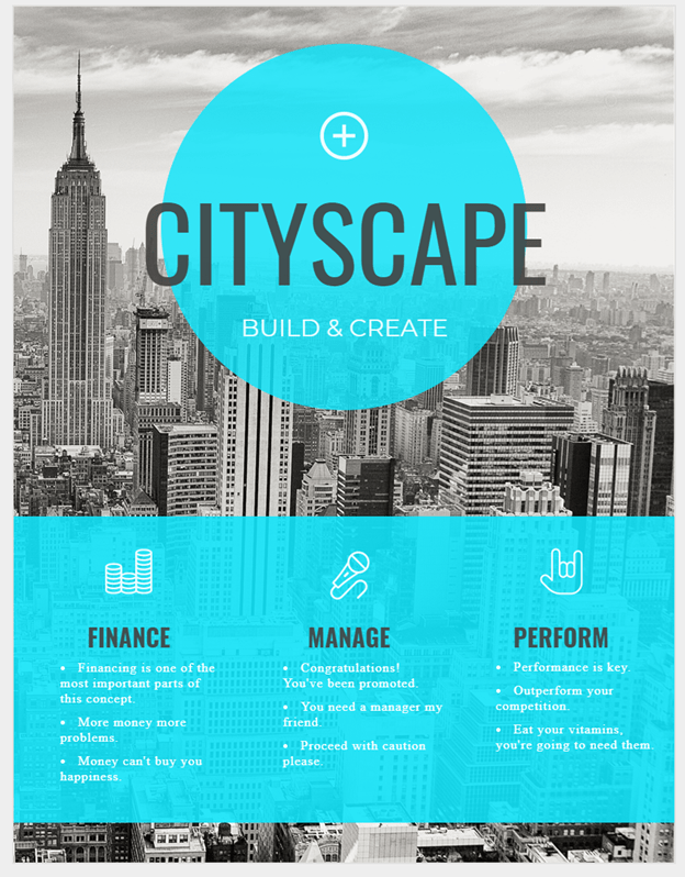
Otherwise, you’re also free to use any image you feel may be relevant and impactful towards your event!
Take Advantage of Shapes and Space
When it comes to modern graphic design, nothing says classic like flat geometric shapes. The most basic ones are the: triangle, square, and circle; when used properly, they can make for a great, eye-catching effect. The human brain naturally discerns patterns in its surroundings, after all, and that’s a trait you can definitely make use of.
Most of the time, like in the example below, shapes are strong enough to be a standalone feature within your flyer’s design, especially when coupled with good use of positive and negative space. But if it’s not enough, then they make for great add-ons as well, fantastic for emphasizing other elements you may have within your photos, reports, or infographics.
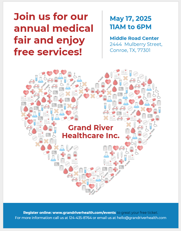
Showcase Icons and Graphics
Building on the previous point, you can definitely integrate more detailed shapes or graphics into your flyers as well.
When photographs and illustrations may not make the cut because they may not be the appropriate style for the message you want to convey, or perhaps for occasions when you don’t have visual assets available at all, or when you don’t want to be too specific with your design, consider using custom-made icons and graphics instead.
They’re considered to be general-purpose and neutral in tone and very easily customizable to match your flyer design—a solid pick for when you’re in a pinch, too.
They work best when placed in modern or minimalist designs, infographics, flyers, and the like. In some cases, they can also be repeated and turned into a pattern instead, which can also make for an exciting design element.
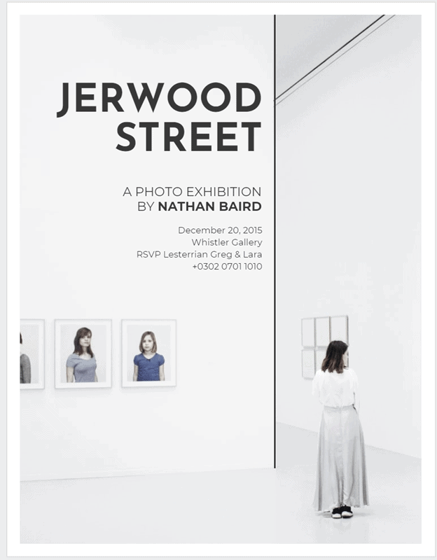
Direct With Leading Lines
Leading lines, a concept most often associated with photography, has made its way into the universal design language, and for a good reason.
When placed within an image are powerful directors of attention, as we naturally follow them when we see them. They’re one of the best tools to use when it comes to creating a flawless visual flow, allowing viewers to take their time to take different elements in as they’re led to the focal point of an image or title. They also add an intrinsic sense of depth to any design, making them feel bigger than they really are.
Have a Limited Color Palette
Color is a fundamental aspect of design. It is most often used to spark interest or group related pieces together.
Contrary to popular belief, eye-catching designs don’t always have to be loud and colorful. Sometimes, simply emphasizing the topic of your flyer is enough.
There are a lot of ways to do this. One of the most popular executions of this rule is to have a monochromatic palette – that is to say, have your design only contain one color. That way, emphasis is only on the subject.
Or to use them similar to leading lines, where they’re arranged in such a way that they direct your viewer’s gaze across your design. For example, you can imagine it’s natural to follow an array of colors from light to dark.
Any way you choose to use it, you can’t go wrong as long as it’s cohesive.
Flyer Design Doesn’t Have to be Complicated
At the end of the day, though, how your flyer will look is completely up to you. Just keep in mind that they’re fantastic tools for promoting events, and as long as your design is cohesive, they’ll get the job done.
But for those who want something quick and easy, there are already a lot of creative flyer design templates out there, and the perfect one is waiting for you to find it!