Web design can influence purchasing decisions and how consumers interact with brands. As we learn to understand more about user behaviour and elements that drive conversions, web design trends continue to evolve.
This list gives you an insight into some of the web design trends we expect to see readily embraced in 2022. Why? Because they make websites more dynamic, interactive, and profitable.
1. 3D Floating Elements

Visuals have always been a key feature of websites. However, limitations have meant the majority of websites look generic. Brands were able to inject their own unique styles, of course, but generally speaking, ‘if you’ve seen one website, you’ve seen them all’.
3D animations will change visuals forever. Moreover, the capacity for web designers to “bring a page to life” will put an end to so-called cookie-cutter auto repair design.
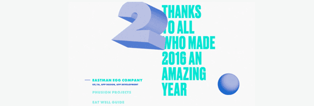
A trend we have already started to see is the use of floating images. This type of design adopts the clever use of shadowing to create the illusion that a feature is protruding from the screen. 3D floating elements are a great strategy to capture the attention of visitors.
2. Blending Graphics With Photography

Creativity is the key that can unlock the hearts of consumers. Think about how Apple has sold its brand reputation for thinking outside the box. In 2022, you will find innovative web design agencies using brazen imagery to create a similar consumer perception for their own clients.
One standout technique will be to use a combination of graphics with real-world photography. For example, animated features in an eye-catching photo or clothes designed with computer graphics superimposed over the photograph of a human or animal.
This technique accentuates a webpage, creates a fresh and fun feel, and can be used to draw the consumer’s attention to a specific piece of information. Creating unique features leaves a positive impression on visitors.
3. 3D Animation

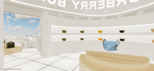
The mass adoption of Pokemon Go captured the public imagination back in 2016. In 2022, augmented reality (AR) is coming to web browsers. Whilst the early adventure into AR was little more than fun and games, advancements in 3D animation are nailed on to revolutionise web design in 2022.
Today’s AR-enabled websites allow visitors to view products in 3D animation and even use AR to see how an item fits into a space or even their body. WebAR promises to significantly increase interaction, functionality, and user experience, which will inevitably boost profits.
4. Auto-Play Videos
Auto-play videos have been a contentious talking point among SEO pundits for a while now. Rightly so. Most people find videos distracting – even with the sound turned off.
The debate will no doubt rumble on, but persistent web designers are changing tactics in 2022. And it might just silence the doubters. Given that 88% of visitors spend longer on websites with videos and 64% of consumers are more likely to purchase a product after watching a video, it might be worth the gamble.
The trick to autoplay videos is to keep the content under 2-minutes and avoid making videos intrusive. Ideally, the video should be the dominant feature on the page.
5. Bold Colours
Studies in colour psychology reveal how colour stimulates parts of the brain and impacts purchasing decisions. In some instances, consumers will choose one brand over another because they prefer the colour.
Whilst colour psychology suggests there is an element of randomness, clever use of colours could swing the baton in your favour. Rather than combining complementary colours (boring), choose bold colours that stand out (stimulating).
Bold and vibrant colours appear playful and entertaining, enhance visual receptors, set the mood, and help to make the interaction more intuitive. Not only that, but bold colours elicit a brand perception which suggests you are full of fresh ideas. That has to be a good thing.
6. Microinteractions
Microinteractions are one of those novel web design trends that seem like a good idea at first but, in our opinion, will soon die out. Having said that, the initial curiosity such designs elicit is sufficient for “cool” features to emerge as a web design trend in 2022.
The purpose of microinteractions is to prompt visitors to perform an action. In doing so, they will be rewarded with an interesting moment either embedded in the design or a big reveal – like more content.
Microinteractions range from simple drag and drop to hovering text links, morphing cursors, and other snazzy design features. Take a look at the examples on this website to give you some ideas.
7. Chatbots

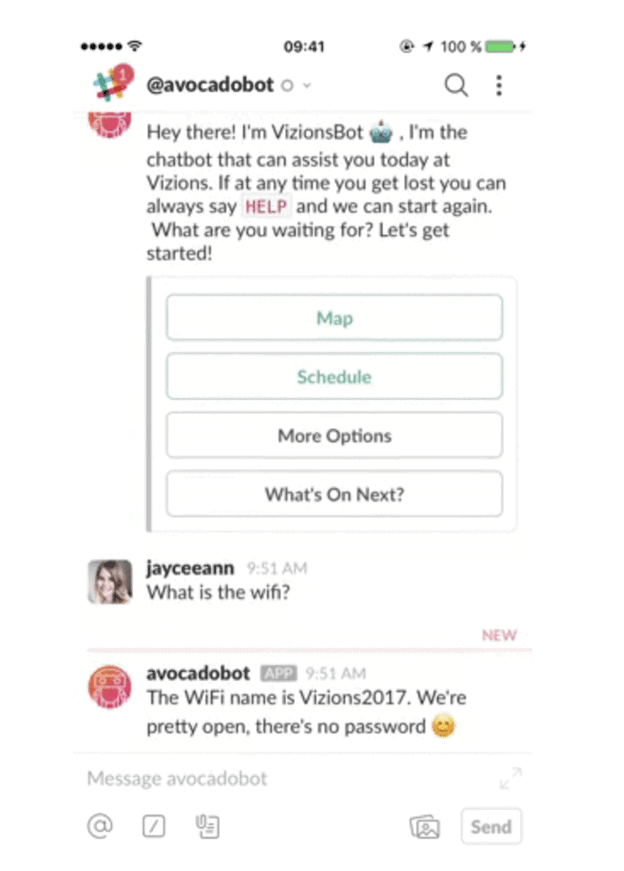
Yeah, yeah, we know chatbots have been around for several years, and we know they’re not very popular with users. However, the reason for that is that the technology was inadequate. But machine learning has come along leaps and bounds in the last year.
Today’s chatbots are better equipped to understand common questions. Frequently asked questions have even been added as a key feature to make it even easier for users to place a query they will get a correct answer to. In 2020, 85% of customer interaction was handled without human agents.
Because chatbots significantly reduce browsing time and are capable of providing answers for a higher percentage of queries, we expect to see a chatbot revolution in 2022.
8. Minimalism
It’s well known that too many elements on a web design can slow down loading times. And slow-loaders are not good for business. The first five seconds of page-load time have the highest impact on conversion rates.
To help websites load faster, Google introduced AMP pages. However, AMP can strip out key elements that are beyond a designer’s control. So the logical solution is to remove them yourself.
Minimalism has proven to be effective at increasing sales because it makes conversion paths clearer and draws the user’s attention to the CTA. The more clutter-free you are able to keep your website, the better will be the focus on the brand’s products, services and messaging. In the words of leading designers from a web design agency in Dubai, successful brands like Apple have shown the world how minimalism is the way to go.
9. Thumb-Friendly Mobile Navigation
Mobile users can often feel frustrated when trying to navigate websites on a small screen. Navigation options are so unusable; visitors find themselves backtracking – or leaving.
Large, thumb-friendly navigation buttons are becoming a popular feature. They are easy to see, easy to use, and can easily be reached with a thumb. Consumers love convenience.
10. Designs for the Disabled
Since the Online Accessibility Act was passed in the US courts in 2020 to make websites accessible for disabled people, web owners have been scrambling to ensure their websites make information accessible to everyone
The legislation is approaching its first year, and public awareness is becoming more widespread. Website owners that do not comply with accessibility regulations should expect a complaint in 2022. And if you do, you have 90 days to fix the issue.